How to create a good footer? Tips & examples
The footer is one of the most important elements of your website. Even if it is not the most impressive in terms of design or content, it will follow the user throughout his navigation on your site.
In fact, contrary to popular belief, footers are seen by a good number of visitors who frequently look for information. As such, if you are curious to know to what extent visitors move around on your website, there are paid tools that will show you the “scrolling depth” on your site: Lucky Orange, Crazy Egg or ClickTale.
What to put in a website footer?
Since it represents the last chance for a visitor to continue browsing, the footer must be both attractive and well thought out to attract attention. A footer is a safety net that catches visitors before they bounce away. It is therefore crucial not to neglect this area of your site.
Start by asking yourself and considering what visitors would like to see in your footer. When thinking about what to put in your footer, be aware that you should only keep what you need.
As you think about it, keep in mind that the purpose of a footer is to display elements that would not be appropriate elsewhere on the page, and that its purpose is to help visitors by adding information and navigation options at the bottom of web pages.
Facilitating navigation
Footer links generally have the lowest click-through rate. However, they should not be ignored.
First of all, do not repeat your main navigation. Do not add your entire sitemap either. Indeed, if you list all your categories in your footer, you end up leading the visitor astray when you should be helping him find his way. In addition, these links are often already included in the main menu.
Think instead that a visitor who arrives at your footer is often a visitor who has not found what he was looking for. So now is the time to make up for it.
To provide a better navigation path through your website, you can check your “Site Search > Search Terms” report in Google Analytics. What are visitors looking for? What can’t they find?
Also in Google Analytics, check your “Behavioral Flow” report. Where do the visitors seem to want to go?
Create a hierarchy
Think of your footer as a separate entity, with its own hierarchy.
First of all, your footer should be divided into a different section for each element: navigation menu, legal notice and TOS, call to action (CTA), social network icons, etc. The most important elements (often contact information or calls to action) should be highlighted.
Next, the most basic way to impute a visual hierarchy to your footer is to divide it into horizontal blocks. These blocks can then be prioritized using several methods:
- Color coding: Text or background colors can suggest relationships. For example, you can use a different color for navigation links and legal notices, or even different colors for different types of navigation links. Also, you can create layers with different colored backgrounds.
- Typography: Typography is a common way to separate elements in a footer. The links on your site may have a different font from the CTA, which may be different from the legal notice and other TOS. Text size is particularly powerful here, as you can minimize the visibility of the legal notices by shrinking them.
- Columns and rows: To keep your footer visually interesting and easier to understand, you can organize the different elements in columns or rows. Navigation links work particularly well in columns, while social network icons and legal notices look better as rows.
A coherent, simple and clear design
In order not to look like an added element, your footer must match the overall design of your website. The colours, font styles and graphic elements should reflect the overall tone.
It is also preferable to favour a simple and clear design, for a better understanding of the information by the visitors.
Once you have organized your links, think about how to make them readable. Choose colours with high contrast, such as a light background with black text or a black background with white text. Avoid using mixed colours or ornate fonts, and make sure that the size of the font and graphics is not too small.
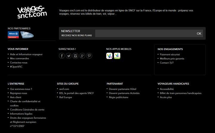
Black background and white text for greater visibility in the voyages-sncf.com footer
Since many (if not all) of the footer elements contain links, leave enough space around the different elements and between lines of text for clarity and to optimize the user experience.
If the elements are too close to each other, users may not be able to reach them. The spacing therefore helps to make them easily clickable, especially on mobile.
Include contact information
While it is a web development standard to have contact information in the header, it is also standard to find a “contact” link in the footer.
This link must lead to your contact page containing a form, not to an email link.
In addition to a link to a “contact” page, it can also be interesting to include other contact information directly in the footer, such as a telephone number or an e-mail address. This is a good way to reassure your customer by highlighting your customer service.
You can also reinforce your customer service image by stating your hours of availability and opening hours, or by indicating that your customers can reach you at any time. That way, if people have a question about your products/services or their order, they know how to go about it.
Finally, location information, such as a physical address, is also something that visitors expect to find in the footer. It’s also a way to tell Google where you are, which is especially important for local businesses.
Use graphic elements
To give your footer more visual appeal, you can add logos or graphic elements. Just be careful not to overload this small space with too many elements.
The inclusion of links to social networks in the footer is deeply rooted in people’s minds, so users have the reflex to scroll the page to find a brand’s social accounts. To save space and add visual stimulation by breaking up the monotony of words, these links are usually displayed as icons. So rather than stating “follow us on Facebook / Twitter / Instagram / Pinterest”, include logos from those social networks.
You can also use small pictograms for links to a map or a phone number.
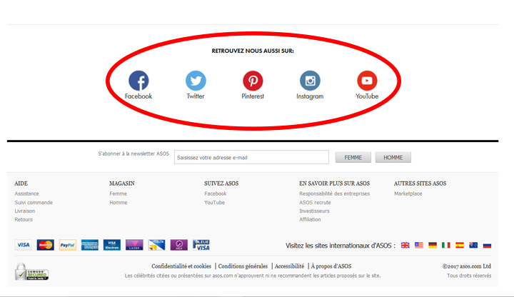
Example of social network icons in the asos.com footer
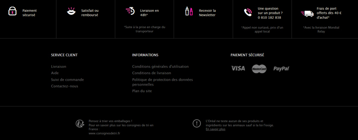
Example of the use of pictograms in the footer loreal-paris.fr/
Keywords for SEO
The text that appears in your footer will appear on each of your pages. This is an excellent place to indicate your relevance to Google. If you decide to include a short message introducing your company, your values or your offers, don’t forget to include your main keywords.
However, be careful not to overdo it. Footer text has been heavily exploited by SEOs in recent years, so Google gives little weight to SEO keywords in the footer.
Include social and reinsurance evidence
- Awards and certifications: if you have already won an award, including it in your footer is a quick way to add credibility to every page of your website. Certifications (security certificate for an e-commerce, certificate for environmentally friendly companies, etc.) can also appear in your footer. By acting as social proof, these small logos give visitors confidence.
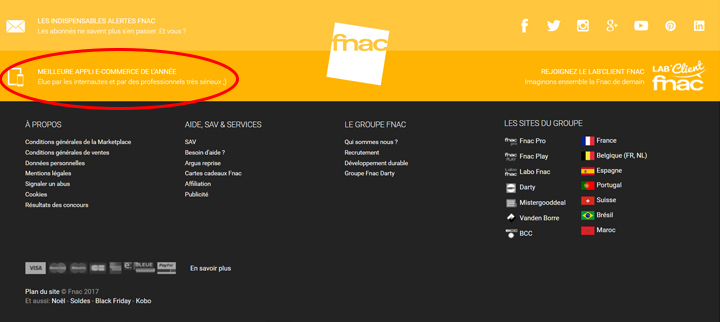
Fnac states in its footer that it has been voted “best e-commerce app of the year”.
- Testimonials: testimonials in a footer are a good way to add social proof throughout the site.
Include editorial content
If you’re active in content marketing, you can give your site a “boost” by embedding your latest content directly in the footer.
You can also choose to display content that answers your visitors’ frequently asked questions, or those that convert visitors into subscribers.
Include a call to action
Don’t forget the value of the footer in terms of conversions and clicks.
Once users have navigated to your footer, take advantage of this opportune moment to give them something to do with a final call to action.
This call to action usually invites people to sign up for your newsletter or follow you on social networks, but it can also give them the opportunity to create a customer account.
If you decide to invite the user to subscribe to your newsletter, you can specify what they will receive if they subscribe, and how often.
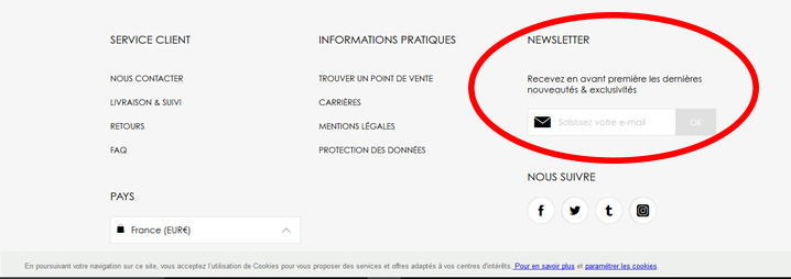
CTA to subscribe to the newsletter in the dior.com footer
Include legal information
Traditionally, the footer is the ideal place to display less visited pages that contain legal information required for a site, but not necessarily interesting for the visitor, such as :
- Copyright: this small line of text often includes the year of publication and the name of the copyright holder
- The credits
- Privacy Policy
- General terms and conditions of sale and use
Discover our tips for writing your GTCs
- The legal notices
- Cookie notifications: If you need to inform shoppers that you use cookies, according to the famous EU law, consider displaying them in the footer to make them less invasive, while still meeting legal requirements.
- Employee login: not all your visitors are prospects. Some may be employees, partners, affiliates or resellers. If you need to place a separate connection for these people, a link in the footer is sufficient. In fact, you organize your site for your customers, not for your employees.
With smaller, unobtrusive text, placing these links in the footer helps them go unnoticed and saves space for more important elements.

cocacola.co.uk footer: minimalist, with just legal information
In summary, a good footer should provide information that allows users to better navigate the site, but also to re-engage them with quality content and give them a way to contact.
Did you like this article?
Subscribe to our newsletter and you will receive our other articles once a month in your mailbox


Leave a Reply
You must be logged in to post a comment.