
11 Insights to improve your site’s user experience in 2023
Optimizing a website requires taking into account so many elements that we sometimes forget how important it is that users have the best possible experience once they arrive on the website…
Yet, user experience is an essential notion in any digital environment.
User experience: definition
User experience (UX) encompasses all the features that increase user satisfaction by improving accessibility, ease of use and efficiency of interaction with the website or e-commerce. It refers to the emotions felt by users when they visit the site.
There is a reason why we return to the same supermarket every week. The reason is the same when we get into the habit of systematically going to the same hairdresser, DIY store or restaurant. These merchants have created a positive experience, which in turn breeds customer loyalty.
In physical retail, brand experience and engagement are the primary drivers of loyalty. E-commerce is not much different. Design, atmosphere, speed and functionality are all pillars of a good user experience on an e-shop.
In concrete terms, it’s about being clear, accessible, easy to “use” and focused not on your business, but on the user.
How to improve the user experience (UX) of a website in 2023?
Improving loading speed
Most Internet users expect a website to load within three to four seconds. Every additional fraction of a second of waiting increases a visitor’s frustration.
A study conducted by Radware found that a 2-second delay in load time during a visit leads to abandonment rates of up to 87%. So to keep visitors on your e-shop and have them come back again, your site must load in less than three seconds.
See also optimize your webperf in 2023
Make navigation intuitive
Your site is not a rebus or a puzzle to solve! Use clear, descriptive headings in navigation menus so users know where to go without hesitation. If they are vague, the user will not understand where each heading will lead him. In this sense, and in order not to lose the visitor, the navigation path (breadcrumb trail) must appear clearly on each page.
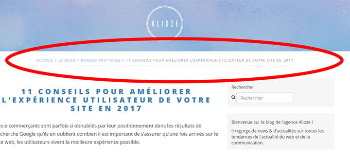
Example of a breadcrumb trail
Also, never leave users wondering where they should go after they finish viewing one of your pages. Suggest an alternative exit or route, for example by adding “you’ll like it too” suggestions at the bottom of product pages on an e-commerce site.
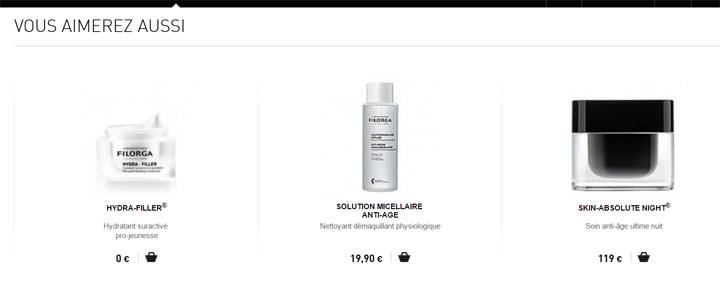
Related product suggestions on a Filorga.com product page
Aerating your web pages
Keeping enough white space between elements (text, headlines, photos, videos, etc.) remains one of the most elegant and easy ways to draw the user’s attention to the most important information on your website. In addition to highlighting the essential content, these spaces improve reading comprehension and make the overall look of the site more pleasant and modern.
Make your site accessible from all devices
In 2019, people browse websites at work, on the go and in their living rooms. When a computer isn’t nearby, they log on to their smartphone or tablet to browse the internet.
The responsive thus represents a crucial part of the user experience. It allows websites to change their layouts according to the visitor’s screen resolution. Therefore, you need to make sure that your website / e-commerce site is responsive so that users can access and purchase from your site regardless of the devices they use.
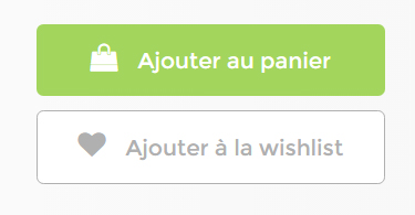
Use calls to action
The calls to action tell visitors what to do on your website. These should stand out clearly from the rest through:
- The color: should be in contrast with the background color to be easily identified by the user. Before choosing the color of your call to action, find out what emotions are associated with it. Different colors evoke different messages. Think about the message you want to convey and choose your call-to-action button color accordingly.
Discover also our article on the influence of the color psychology in web marketing
- Le texte : évitez d’utiliser des textes qui n’expriment pas clairement ce vers quoi va l’internaute en cliquant. Bannissez les « Suivant », « Soumettre » et autre « Continuer ». Préférez-leur des mots qui indiquent clairement au visiteur ce qu’il obtiendra en cliquant sur votre bouton d’appel à l’action.
Example of call to action button on the site labo-svr.com
- For every action or effort you solicit from users, give them something in return. For example, if you ask for a phone number, explain why and when you will use it. Example:”we will contact you if there is a problem with your order”.
Include a search bar
Imagine a website like Amazon without a search bar. Would people find the products they want so easily? Definitely not. The same is true for your e-commerce.
When potential customers search for a specific item on your site, they’ll be frustrated that they can’t locate it easily. And a bad user experience often leads to frustration, which undermines user satisfaction.
Provide complete contact information
Your customers may have a question when they visit your website. Therefore, you need to include your complete contact information so that they can contact you at any time. The contact page should contain the following information:
- Full name of the company
- Contact address
- Phone number
- Email address
For a better user experience, include the phone number and email address in the footer of all your pages. When your potential customers see your contact information, they immediately perceive your legitimacy, which helps build their trust.
See also our tips for creating a good footer
Improving content
For most websites, UX isn’t just about all-out interactions, eye-catching design or intuitive navigation. A satisfying user experience also depends on how information is delivered. It must be in the right place, at the right time and in an engaging way :
- Focus your speech on the user: favor the personal pronoun “you” over “we” or passive turns of phrase. Being polite implies the visitor and gives them a sense of belonging.
- Remove all technical jargon from your textual content: you don’t need to spout big, abstract words to make a great statement. Instead, the best way to get a message across is almost always the simplest. Even if you don’t doubt the culture and professionalism of your target audience, it’s always better for UX to write as if you’re only speaking to beginners. After all, people who understand you may ignore the explanations – but the rest will have to look elsewhere.
- Get to the point: on the web 2019, the user does not appreciate long paving stones. He prefers them brief texts, which deliver the information quickly. So remove every word that is not 100% necessary. You can remove adverbs, adjectives or replace the conjugations of the verb “to be” with a more dynamic verb to add more punch and shorten your sentences.
- Install an engaging tone and incorporate an appropriate dose of humor.
- Implement animations and transitions that match your brand personality.
Set up a chatbot system
Setting up a live chat or chatbot is a good way to improve the UX of your e-commerce along with the conversion rate. This system triggers a popup window allowing the user to get in touch with a sales consultant or a conversational agent. If the user needs help or has questions (about delivery or return policy, for example), he can chat with the advisor or the chatbot.
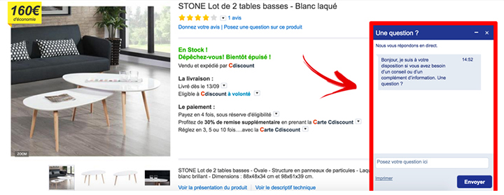
Example of live chat with an advisor on the e-commerce Cdiscount.com
Find also 10 examples of chatbots to use to boost your business
Storytelling techniques
Storytelling is an integral part of branding. On its e-commerce, a brand must know how to tell its story: put forward the universe, the vision, the values that make it unique to involve the visitor emotionally. The story and the values claimed will be the basis of the feelings born in the customers. Use icons, images, videos and emotionally engaging animations to make your customers’ experience attractive.
In summary, a good user experience on a website allows visitors to find everything they are looking for easily and quickly. It’s up to you to create a content-rich website/e-commerce site that creates engagement in order to build customer loyalty. By following all of these tips, your conversion rate should then increase significantly over time.


Leave a Reply
You must be logged in to post a comment.