Optimizing your website for mobile: best practices 2023
Fplus de As we move into a multi-screen world, optimizing your website for mobile in 2023 is the watchword of the decade. Regardless of the devices they use, users expect :
- See the same contents ;
- Be able to easily search for information, subscribe to a newsletter, place an order on an e-commerce site or share content on social networks.
In 2021 more than ever, the web is something we carry in our pockets, not something locked in our computers or homes. Portability is a global trend that is growing year after year.
The rise of mobile Internet use is accompanied by new ways of using websites. It is therefore essential to think differently about the organization, navigation and layout.
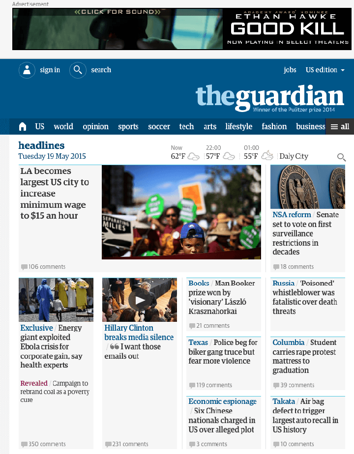
The Guardian mobile website

Responsive web design Guardian
Mobile devices, smartphones and tablets, differ from computers in many ways, including:
- Screen size;
- Processing power;
- Connection speed.
These different limitations and capacities justify different solutions. It is therefore better to take each of these devices into account in the code, rather than designing only for one of them.
Responsive design vs. mobile-first vs. mobile site vs. mobile application in 2023
When it comes to developing and optimizing a website for mobile, there are four possible solutions:
- The responsive design: consists in developing a site in “full screen” and then adapting it to lower screen resolutions. In terms of mobile web design, this means that a full, standard website gradually reduces content and functionality as the window gets smaller and the system simpler.
- Mobile-first: This trend can be defined in many different ways, but essentially boils down to prioritizing the needs of mobile users over computer users. With mobile-first, the user experience is built around the fingers, not around the mouse and clicks. Its design can be summed up in two main ideas: simplicity (reducing the content to its most vital elements) and size (with a small screen size, each element must be carefully considered). A mobile-first design consists of starting to develop the website by taking into account the constraints of mobile, then working this base to arrive at a desktop version. As needs arise, the site can be progressively “improved” and even completely redesigned for larger platforms with fewer constraints.
- A separate mobile site: sometimes called M-dot, this configuration delivers different HTML code on separate URLs depending on the device detected. Usually, this consists of having the desktop site located on the www sub-domain and the mobile-friendly site pages located on the “m” sub-domain. Separate mobile sites, such as “m.simplesite.com”, provide a different browsing experience for users on different devices. However, when consistency is the goal, it becomes easy to see why consistency is not the ideal solution.

Example of a mobile website by Amazon
While in theory mobile sites load faster, the extra time to redirect your entire site to the M-dot (unless the user types in the URL directly) is unnecessary. Multiple websites for a single domain become expensive to maintain and difficult to update. Offering one site optimized for mobile and another for computers means you have to keep two sites up to date, doubling your workload. One site is much easier to manage than two. In addition, mobile devices no longer have a single screen size. So what was once the greatest strength of M-dot sites is now its greatest weakness. M-dot sites are designed for a specific screen size, but mobile devices range from 320 × 240 for some smartphones to 768 × 1024 (and beyond) for tablets.
- A mobile application: building a mobile application to enhance the browsing experience of mobile visitors can be a good idea if you offer a social or interactive platform, or when your site is your product. But if this is not the case, there is no good reason why the mobile user should feel obliged to download your application, install it and use it just to visit your website. Other disadvantages of applications are their limited amount of content and functionality, and the specificities of each operating system. You will most likely have to develop for both Android and iOS.
Weighing the pros and cons, we quickly realize that in 2019, responsive web design is emerging as the best way to create and optimize a mobile website that satisfies the user experience.
By giving users a consistent quality, it increases both traffic, SEO and conversion rates.
Focus on responsive web design in 2023
This design approach uses fluid grids, flexible images, and varied CSS style rules to provide different experiences for users of computers, tablets, and mobile devices, while maintaining the same HTML and URL structure.
With responsive design, the layout of the mobile website shrinks or expands depending on the size of the screen used to view it.
In other words, responsive design makes adjustments so that someone viewing a website on a mobile device is able to see the same content and navigate as easily as people viewing the site from their computer.
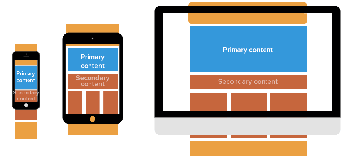
Responsive design is built around the concept of media queries that target specific devices and window sizes. With this in mind, you can code your initial CSS from a mobile perspective and then use media queries to selectively serve up additional styling if the window size increases.
Reponsive design and SEO
The increasing number of people searching Google from a mobile device is a trend to consider when planning an SEO strategy in 2019.
“More Google searches take place on mobile devices than on computers in 10 countries, including the United States and Japan.”
However, the debate persists as to whether a separate mobile website or a single responsive site is the best route to take. From an SEO point of view, the responsive website is unequivocally the best option.
This is because separate mobile websites have their own URL and HTML code that is different from their desktop counterpart. In contrast, responsive sites use a single URL and a set of pages and files that simplify Google’s crawling and indexing of the content.
One of the main challenges of having a separate mobile site is the need to build the authority of that site from scratch. And most distinct mobile sites rank poorly in search engines, being canonized to their desktop counterpart.
Instead, making your website responsive will help maintain backlinks and means you can focus your SEO on a single site. All your links will then be directed to a domain, giving your responsive website a boost in the SERPs.
Also, if you have a responsive website, you can share your links with a unique URL on social networks.
For these reasons, Google officially recommends that SEO-conscious businesses create a responsive website that works the same on all devices.
But the search engine giant is not only advocating responsive web design as the best way to target mobile users. Google also favours the positioning of sites optimised for mobiles in its dedicated search results.
This is especially true when mobile users search for local services and, more recently, with the highlighting in search results of articles using AMP, the mobile format launched by Google. AMP-stamped content is displayed in a highly visible image carousel above traditional mobile search results.
Discover also our article on
Google AMP, the mobile format that your web pages need
Responsive design and bounce rate
A responsive website helps combat a high bounce rate. Indeed, even if a website displays well in search results thanks to good SEO practices, the bounce rate will be a concern if it doesn’t work effectively for mobile and tablet users.
Mobile websites can suffer from high bounce rates if the content they offer is too messy or too dissimilar to the content offered on the desktop version of the site. Google will interpret this high bounce rate as a sign that a website is not offering relevant content to users, which is likely to lead to a drop in ranking.
Fortunately, the responsive website combats this problem by presenting the same content, but in a functional way.
Responsive web design means that there is no need to compromise on the content you choose to display, ensuring that visitors always receive the information they are looking for.
Responsive design and user experience
Viewing a website on a touch screen can be difficult: it often requires dragging, scrolling and changing the size of the page. If visitors are browsing a site via their smartphone or tablet, they need to be able to view the full content as easily as computer users. Having a responsive design makes it easy for mobile users to find and share content, which provides a good user experience on mobile.
Companies must therefore design their site in responsive so that users get a quality experience and access to all the information and tools they might need, regardless of the type of device they use.
Above all, responsive design puts the focus on the user; and with user experience being an important ranking factor, it makes sense for Google to encourage developers to adopt responsive design and optimize their site for mobile.
Also check out our 11 tips for improving your site’s user experience
Responsive design and conversion rate
Having a responsive website ensures that visitors are able to access all the information and features they want wherever they are, regardless of the type of device they are using. This will encourage them to stay on the site longer and potentially convert.
In this sense, various e-commerce sites have seen a considerable increase in the conversion rate after switching their e-shop to responsive. According to a report, 62% of companies surveyed saw their online sales increase by 62% after making their e-commerce responsive.
To go further :


Leave a Reply
You must be logged in to post a comment.