
How do you create a call-to-action button that converts?
Looking for a way to optimize your conversion rates? Take the time to think about creating good call-to-action buttons: they are critical to converting your website visitors into leads.
How to design an effective CTA? How do you write wording that encourages your prospects to enter and then progress through the conversion tunnel?
Follow our tips and best practices to create a good call to action button!
What is a call to action?
In marketing, calls to action (also called CTAs) are buttons or links placed on different pages of a website (homepage, landing page, category page, product page, blog post, checkout pages, etc.).
Visually, the call to action guides your visitors through your website and conversion tunnel, telling them to take a specified action. This action can also encourage potential customers to :
- Download a white paper
- Fill in a form
- Read other articles from your blog
- Share your content on social networks
- Subscribe to a newsletter
- Buy a product
- Proceed to payment
In short, the call to action can be used anywhere you want your visitor to perform a task.
Best practices for creating good calls to action
When creating your calls to action, there are two things you need to consider to optimize them:
- The design: style, shape, colour and placement.
- The wording: text, words and formulation.
Optimize the design of a call to action
The ultimate goal of your CTA is to attract attention and direct a user to an action. Visually, it must therefore stand out on the page in relation to the surrounding content.
Size
Because the call to action should be one of the most visible elements on a web page, it should be big enough to attract attention and not get lost in the content.
The rule is to give your button a size that makes sense. In other words, it should be big enough for your website visitors to comfortably click on, but not too imposing at the risk of looking too teaser and artificial.
Since the majority of traffic now comes from mobile devices, no matter what size you choose, make sure it’s big enough to be read, seen and clicked on a smartphone. A minimum size of 44 x 44 pixels is recommended for any clickable element.
Also find out how to optimize your website for mobile
Color
To make your CTA stand out and grab the user’s attention, you need to create a contrast with the surrounding content.
For this, your call to action button should be colored. Preferably, forget white, grey and black. Instead, use a color that stands out, is eye-catching and consistent with your brand.
Discover the psychological influence of colors in web marketing
You might also consider using orange, red or green, which tend to convert better than other colors.
However, this decision will also (and most importantly!) depend on your website’s color scheme, existing design elements and background color. The color you choose will either work in conjunction with the colors of your website, or because it will contrast completely with the rest of the page.
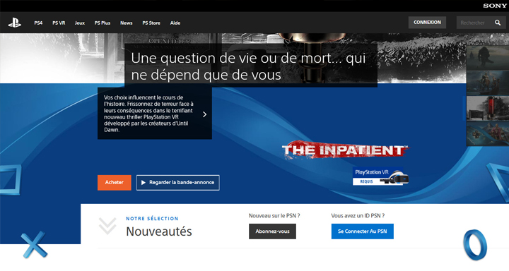
On the Playstation homepage, the orange call-to-action button contrasts with the other colors on the page
If you have trouble determining which color attracts the most attention, you can create several buttons and test them at a glance. You can use a tool like Button Optimizer, to quickly create them, and then put them all side by side. Which one is more noticeable? Which one stands out the most? Which one do you look at first?
Form and style
To encourage the user to click on your call-to-action button, it is logical that they know it is clickable. Yes, it seems obvious, but to get more clicks, your button must look like… a button!
To do this, choose a rectangular shape, define it with clear borders and surround it with white or empty spaces. If necessary, frame it to create more contrast.
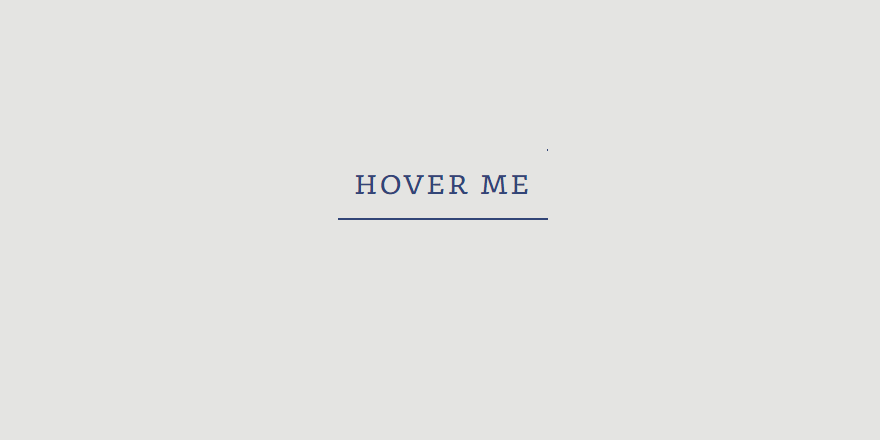
You can also create a hover to change the appearance of your button on mouseover:
- colour change
- grayed out/decayed effect
- size change
- appearance of a shadow
Placement on the page
Another consideration when creating your call-to-action button is its placement on the page.
If your CTA is not in the right place at the right time, i.e. when your visitor is ready to act, you may miss out on a conversion.
So where should you place your call-to-action button?
The answer is that it depends. Ideally, especially for an e-commerce site, it should be above the waterline. But this is not always true, as its placement will depend mostly on the case.
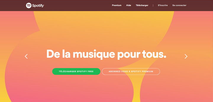
On spotify.com, the CTA is placed at the very top of the page and is simply supported by a “minimalist” design and a catchphrase.
In fact, to know the ideal placement of your button on the page, you need to consider where your visitor is in their buying cycle and whether it matches what your CTA offers at that time. Your intention is not to spam a potential customer with a call-to-action button that they are not yet ready to click.
If your CTA is about a particular offer, placing it at the end of a relevant blog post, for example, may be the best option to echo the content that was just consumed.
Surrounding content
The call-to-action button may be a separate element on your page, but it must be served, supported and consistent with the content that surrounds it.
However, there is no need to use excessive visual effects to direct your visitors’ eyes to your button. Avoid arrows and flashing elements.
Instead, go for the sim-pli-ci-té. Incorporating empty space around your CTA will be enough to set it apart from the rest of your content.
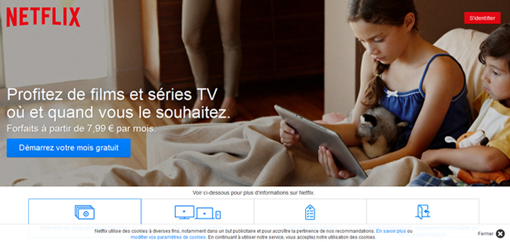
You can also use your content more subtly, for example by choosing images of people facing or looking in the direction of your button, as in this example from Netflix:
Images that represent positive emotions, such as fun, can also help increase the click-through rate on your button.
Finally, support your call-to-action button with compelling messages. Around it, you can place reassurance elements, such as customer reviews, guarantees (“no risk”, “no commitment”, “money back guarantee”, “secure payment”) and promises of privacy.
Optimize the wording of a call to action
When writing the wording for your call-to-action button, the words really matter. Combined with good design, they can inspire people to action.
Clarity, precision and conciseness
The wording of your call to action button must be clear, short, concise, precise and punchy.
To do this, just choose a few words very carefully. Four or five words are enough, no more than 60 characters. If your CTA is longer than 10 words, it will lose effectiveness.
When users see your call-to-action button, they should no longer be in read mode. They are ready to click. Your wording should therefore be readable at a glance. If it takes more than two seconds to read it, it is too long.
Action verbs
Your call-to-action button should clearly describe the direction and decision you want your visitors to make.
To do this, avoid passive language, and use action verbs that suggest momentum:
- Book
- See
- Start
- Join
- Read
- Discover
- Get
- Try
Avoid frictional verbs, which can make people hesitate and lack impetus and punch, such as “submit,” “order,” “buy,” or “register.” Your CTA should suggest to the visitor to take action, as if it were obvious.
Urgency and rarity
To give visitors the impression that they need to act and make a decision quickly, a CTA can use urgency and scarcity.
This tactic is well known by marketers to trigger the fear of missing out or missing out on an offer. That’s what happens when a call-to-action button encourages “try now”, or when a countdown timer goes off to show that the offer is about to expire.
Words like “now,” “today,” or “limited offer,” inserted into the wording of your call to action, stimulate people to take action. As long as people feel rushed, you’ve achieved your goal.
Risk minimization
In your call to action, you can use safeguards words in order to reduce the perceived risks for the user. Any type of money back guarantee or free trial period helps convince the user that they are taking little risk by clicking on your call to action button.
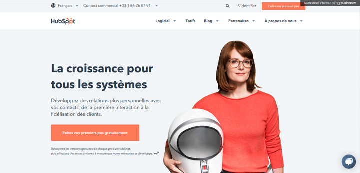
Hubspot puts the spotlight on free in its call-to-action button
Use of “I
A call to action in the imperative gives a clear and direct command of what to do.
But you may want to consider dropping “you” or the infinitive, in favor of “I”. It’s a great way to include your visitor, personalize their experience, and give them a sense of control over the process.
Some studies have shown that using the first person can increase conversion rates.
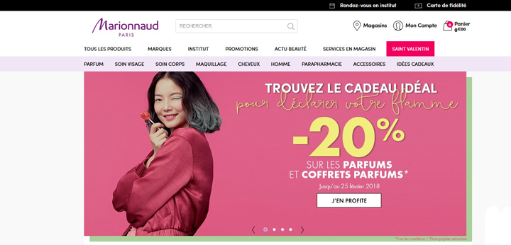
Use of “I” on marionnaud.fr
Benefits and value
To create a good call to action, remember to clearly present your value proposition in your wording with a few strategic words.
Avoid generic CTAs such as “click here” or “contact us”. Instead, titillate your visitor’s desire by making it clear that they will get something useful or enjoyable by clicking on your call-to-action button.
The more you describe the action you want your prospect to take and what they will get by clicking that button, the better. Use this example as a guide:
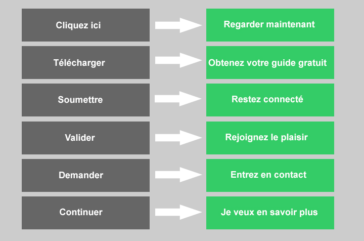
In this example, the CTAs in the first column use an action-oriented verb, of course, but they don’t tell visitors anything about what they’ll get in return after clicking. In the second column, they know the benefit they will get from their clicks: get a free guide, join the fun, stay connected…
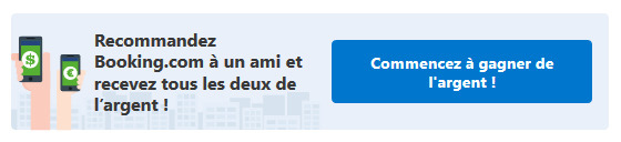
Be creative! As long as your CTA directly reflects the message of the surrounding or preceding content, it will seem much more appealing to your potential customers. Your call to action button should resonate with your storytelling, and invite the visitor to continue the journey and experience they have begun, just like Booking :
Test your call-to-action button
Once you’ve implemented all of these tips, there’s no telling what you’ve created the best CTA possible. There is no secret: the only way to find out is to test different variants!
Use A/B tests, dividing the number of impressions by the number of clicks, to evaluate the impact of your CTA changes on conversion rates.
Try different messages, colors, sizes, designs, placements… they can all affect how your call-to-action button is seen, interpreted and perceived.
Test one element at a time until you find the most effective combinations. In many cases, even small changes can have a significant impact on conversion rates.
HubSpot, Optimizely and other marketing software will allow you to easily perform these tests.
In conclusion, while there are good practices, there is no magic formula for creating a good call to action. No amount of color, size, or text will improve your conversions for sure. You need to choose elements that fit your niche and your audience.
It’s also what surrounds your CTA, the story you tell on your website, that will make the difference. All the elements that surround and lead up to your call to action should build a kind of anticipation in the minds of your customers.
The effectiveness of your buttons is not just a matter of your choice of words or color, but rather the promise to your visitors that their story will improve after they click on them.


Leave a Reply
You must be logged in to post a comment.