
Consciously or unconsciously, the colours that surround us affect our perception of things, our mood and our behaviour on a daily basis.
Marketing is no exception! In all aspects of design, from logo to website design, each colour influences the consumer’s perception of a brand and the values it stands for.
When used properly, a colour can convey a specific message and generate different feelings. A color even has the power to improve conversions by attracting attention and triggering the right emotions.
The Power of Color Psychology in Marketing
Understanding the psychology of color in marketing means mastering a tool that can be used to optimize your brand’s visual identity, capture customers’ attention, and improve the user experience.
Also check out our 11 tips for improving your site’s user experience.
Of course, the link between colour and emotion is complex. The psychology of color in marketing is not always an exact science, as the meanings of colors are the result of many factors:
- personal experiences ;
- genre ;
- political leanings ;
- context ;
- cultural differences, etc.
In this regard, the first question to ask yourself when choosing a colour is: who is my target audience?
If you are aiming at an international audience, you will have to turn to “universal” colour combinations. Indeed, what one culture perceives as positive may appear negative to another. For example, the West associates white with purity and innocence, while in China it symbolizes death. The meaning of a colour can therefore change completely depending on the country or part of the world in which you are.
The gender of your target audience is also important to consider. You can use different studies to choose colours over others, depending on whether you are targeting women or men.
For example, women are more interested in soft colours and are receptive to shades. They generally prefer blue, purple and green and are reluctant to use colours such as grey, brown and orange.
Men, on the other hand, are more likely to appreciate bright colours and are receptive to shades. They generally prefer blue, green and black, but are less fond of brown, orange or purple.
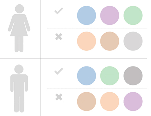
Favourite colours by gender
So you need to consider all of these aspects to find THE right color combination for the type of audience your marketing is targeting.
There are also broader factors in the perceptions of colour and the role it plays in purchasing decisions and brand image.
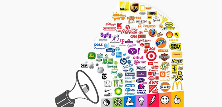
Numerous studies indicate that certain colours can trigger a range of emotions and behaviours associated with purchasing. For example, one company found that up to 90% of instantaneous product judgments are based on color alone.
And, in terms of conversion rate, colors are just as important. A CTA (call to action button) with a colour that stands out from the other content on the site could, for example, increase the conversion rate by 11%, and add to cart rates by 6.5%.
Also find out how to create a CTA that converts
There is also a link between the use of colour and customers’ perception of a brand’s personality.
Research results show, for example, that the perception of a company depends on the relevance of the colour used for the brand. In other words, the colour must be relevant to the product(s) or service(s) being sold. This confirms that purchase intent is greatly affected by colors, because of the impact they have on how a brand is perceived. After all, who would want to buy a Harley Davidson motorcycle if it didn’t have a cool, rugged feel?
Other studies reveal that as consumers, we prefer recognizable brands, which makes color incredibly important when creating brand identity. It has even been suggested that new brands should specifically target colours for their logo that differentiate them from incumbent competitors. In other words, if the competition uses blue, you will stand out by using purple.
The context in which a company operates is therefore an absolutely essential consideration. Without this context, choosing one colour over another will not make much sense, and there is no evidence that using orange over pink will encourage people to buy a product.
It is the feeling, mood and image that your brand creates that plays a persuasive role. So, make sure your colors reinforce your brand image and the message you want to convey.
Symbolic perception of colours
Remember that these color symbols are only guidelines. The most important thing is that all your colours complement each other, create harmony and do not clash with the brand’s imaginary ideal shade.
Blue
Blue is one of the most popular colours in the trade. It inspires reliability, offers an air of freshness and encourages feelings of productivity, calmness, tranquillity and confidence.
Use of blue for web and marketing :
- For companies that carry out prescriptions (health care) or monetary transactions (banks, finance).
- For high-tech companies.
- For companies in the field of transport, travel and escape.
- To represent any activity that requires reliability and security.
Example:
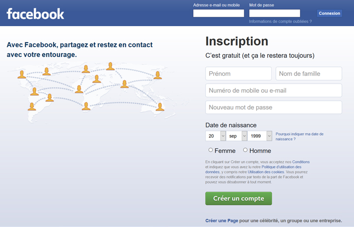
The world’s largest social network, Facebook, has integrated blue into every facet of its site. The banner is blue. The logo is blue. Your friends’ names are blue. When you like something, the “thumbs up” symbol turns blue. For a company whose core values are transparency and trust, this is obviously no accident. There’s no doubt that Facebook is taking advantage of the calm and safe feeling of this color to reassure its users when they share their personal information.
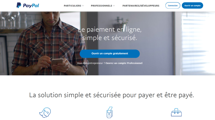
PayPal, a platform through which billions of euros pass, has also opted for the colour blue to reassure people of its reliability.
Red
No other color catches the eye like red, often considered the most effective color for calls to action. Stimulating, intense and powerful, red is associated with passion, power and sometimes anger. It can be used for warnings or to signal danger, but it can also suggest urgency, which is why it is often used for clearance sales. Red is also known to stimulate the appetite and at the same time is often a symbol of ambition, boldness and authority. It can therefore have a strong impact on the brand image.
Use of red for web and marketing :
- For websites and companies that want to suggest energy.
- For food, technology, transport and agriculture companies.
- For products to be purchased on impulse.
Example:
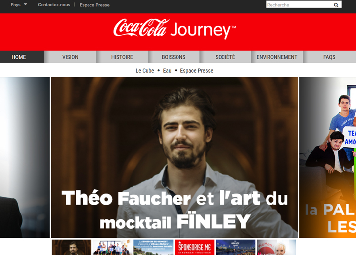
The primary colour in the design of the Coca-Cola website is red. The combination with grey and white gives it a better visibility. Coca-Cola’s promotion of happiness through its famous slogan “Savour the moment” goes perfectly with the colour red which evokes feelings of excitement and energy.
Green
Green is the color of relaxation and tranquility. It promotes feelings of rejuvenation, optimism, growth, harmony and calm, which is why it is often used in stores to help customers relax while shopping. Green is also the colour of wealth. Wealth in the literal sense – money – and also, of course, the wealth of nature. Many companies use green to emphasize their ecological commitment and respect for the planet.
Using green for web and marketing:
- To suggest affluence, growth or stability.
- For companies that want to reflect relaxation, freshness and honesty.
- For companies in the energy market.
- For an environmental company or for the sale of organic products.
Example:
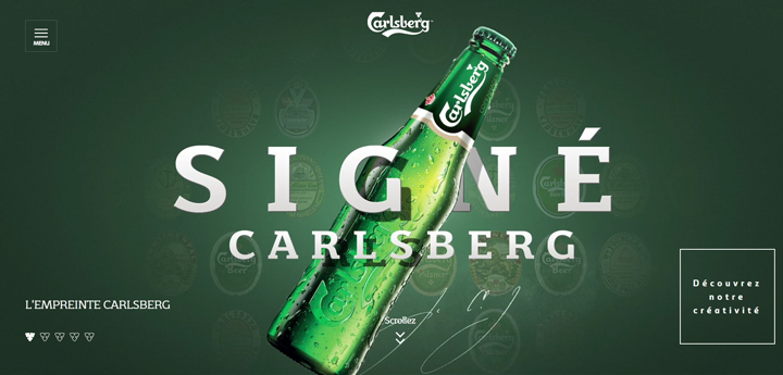
Carlsberg, a Danish beer brand, uses a strong and elegant green colour for its design and marketing, which is meant to relieve stress, suggest freshness, nature and love for life. The whole thing gives the impression of a clean and relaxing experience.
Yellow
Yellow is often considered an energizing and optimistic color. From the earliest times, it refers to the sun and is therefore psychologically associated with warmth and happiness. But it is also the most tiring colour for the eye. Yellow can be confusing and should be used sparingly. In more subtle shades, it can suggest yellowed parchment and can therefore also be associated with caution, wisdom and curiosity.
Use of yellow for web and marketing :
- For companies that sell children’s products, such as clothing or toys.
- For food companies.
- For companies looking to evoke feelings of joy, authority, intelligence or energy.
- To market products related to the home and interior decoration.
Example:

The website dedicated to Pharell Williams’ 24-hour video clip “Happpy” is an excellent example of using the color yellow to promote a joyful and animated user experience.

McDonalds’ famous red and yellow combination is not a coincidence: it is intended to provoke excitement in children and suggests a touch of madness.
Violet
Purple is associated with elegance and sophistication. It conveys wealth, power and royalty and gives the feeling of being unique. It is also a colour that stimulates the mind and invites contemplation. Purple should be used with caution, however, as some shades can have the opposite effect and look a little “cheap”.
Using purple for web and marketing:
- For luxury companies.
- To market beauty products.
- For healthcare, technology and finance companies.
Example:
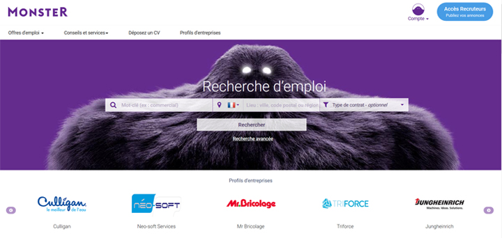
Monster.com uses purple to give the visitor the feeling that the site is trustworthy and, most importantly, authoritative.
Orange
Vibrant, energetic, friendly and welcoming, orange is a more balanced and less “overwhelming” colour than red. It attracts attention, but rather emits a sense of warmth as opposed to urgency. It communicates ambition, enthusiasm and confidence.
Using orange for web and marketing:
- For technology companies or companies that market gadgets.
- For health care companies.
- To suggest movement and positive energy.
- For creative brands.
Example:
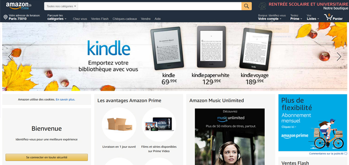
Amazon uses orange in small ways: in the logo, the search bar and the call-to-action buttons. The site is an excellent example of using color to highlight important features without overwhelming users.
Rose
Pink suggests feelings of fun, tenderness and romance. It is a reassuring and soothing color, especially associated with youth and femininity. Both playful and soft, it reminds us of chewing gum and innocence. The effects of pink can vary according to its intensity (light, deep, strong, etc.)
Using pink for web and marketing:
- For companies that want to take a leap into the past.
- For companies that target a female audience.
Example:
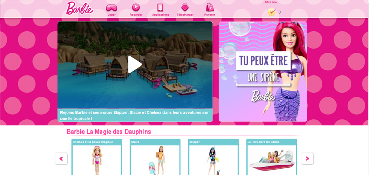
It is impossible to think of the colour pink without thinking of the Barbie doll, which plays the card of a return to childhood, femininity and romanticism.
Brown
Associated with the earth and nature, brown inspires relaxation and calm. While it can sometimes seem lacking in boldness, it is also an elegant and pure colour that can suggest authenticity, reliability, stability, comfort and piety. Chestnut can also stimulate the appetite (chocolate!).
Use of brown for web and marketing :
- For companies in the health and wellness field.
- For craft companies.
- For brands that want to suggest a sense of tradition.
- To market natural or rustic products.
Example:
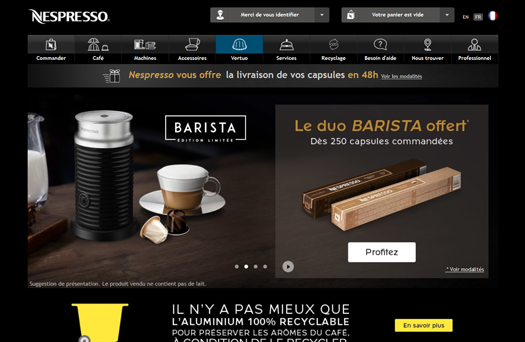
Nespresso uses different shades of brown in small touches on its website to create an elegant, natural and cosy experience that stimulates the appetite.
Black
Even though black is not technically a colour, it is undoubtedly one of the most elegant shades. Versatile, timeless and classic, it goes well with all other colours. Black is associated with authority, mystery, depth, darkness and power. It can therefore be intimidating, but can also create a sense of sophistication. Be careful not to use it for call-to-action buttons, as they may go unnoticed.
Using black for web and marketing:
- For brands that want to communicate authority, power or elegance.
- To market luxury products, technology.
- For the automotive sector.
- For high-end companies.
Example:
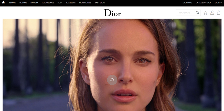
Dior uses black to signify luxury, communicate glamour, sophistication and exclusivity. Objective: to make people understand that the brand is a serious value.
White
White reflects light, so it awakens the eyes. It is associated with organization, equality and, more commonly, with purity and innocence. It is also associated with cleanliness, simplicity and novelty.
Using white for web and marketing:
- To reflect the ideal of perfection.
- For health, healthcare or charity businesses.
Example:
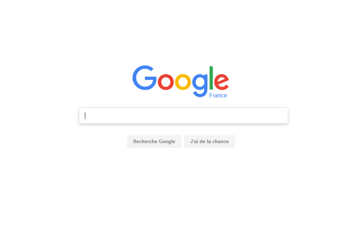
The abundant use of white space is a design feature to create an airy experience and a sense of freedom. Take for example the most popular site in the world: Google. The search engine uses mainly white.
Determining a color scheme for web design
Both in your marketing and in the creation of your website, it is unlikely that you will use only one colour.
While taking into account the psychology of color, and the impact of each color on your customers, you will then need to consider how the secondary colors match the primary color you are using.
With this in mind, you should take care to mix your colours correctly. To help you, you can use three basic methods:
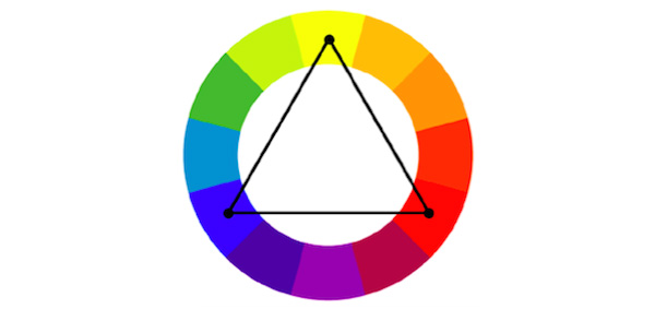
- Triadic: This is the simplest and most balanced method of finding an easy-to-use color scheme. It uses the complementarity of colors. Using the color wheel, you can select three colors located 120 degrees apart for the background, content and navigation of your website.
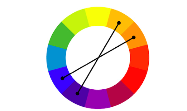
- Complementary: This method is a bit more complicated, and you will probably have to make several attempts before finding the right combination. It uses four colours: two contrasting pairs of two complementary colours.
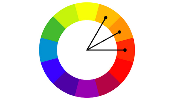
- Analog: this method consists of choosing colours that fall within the same area of the colour spectrum. The colours are complementary and differ mainly in their dynamism.
Whichever method you use, it is recommended that you limit your colour combination to two, three or four colours at most.
As a general rule, each color used should appear in several places on the website:
- logo ;
- pop-ups ;
- titles ;
- navigation tabs ;
- drop-down menu ;
- background ;
- buttons, especially the calls to action;
- footer.
When a brand already has a logo, one technique is to extract a color from it, and use it in navigation paths, hyperlinks, and then use another color from the logo for the background, headers, etc. Repetition of color is a sure way to give a brand a unified and consistent visual identity.
It’s also ideal to use neutral colors (white, black, gray, brown, beige, etc.) for the background, as they work well with almost any color scheme.
Punchier or “emotional” colors can then be used for certain important elements of the website, such as CTAs or navigation tabs, to make them stand out due to the isolation effect (also known as the “Von Restorff effect”) which proves that we remember things that stand out better. In color psychology, this isolation effect occurs when an element, such as a conversion step, is the only element of a particular color.
In conclusion, color is an essential aspect of a brand’s visual identity, which must correspond to its overall personality.
Colors help create a specific mood and environment for your customers, whether it’s a bright red to evoke a sense of urgency, or a purple for sophistication. Just keep in mind that your color choices should reflect your company and your products.
To go further :
- discover the two colors of the year 2021 elected by Pantone
- you can watch this very interesting video on the power and psychology of colors:
